SPRINKLR DISPLAY PRODUCT
How we transformed a basic social listening tool into a social data analytics powerhouse.


ABOUT DISPLAY
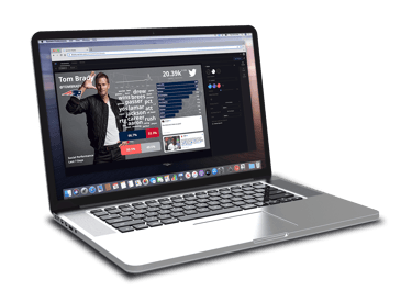
Sprinklr's Display is a top visualization tool that turns complex data into actionable insights and engaging brand experiences. It provides real-time command centers, keeping teams informed and aligned. This powerful tool empowers users with real-time, wall-to-wall command centers, ensuring everyone stays informed and aligned.
In 2016, Sprinklr acquired Postano, a leading social visualization platform, and used its technology to develop Display. I was part of the team tasked to redesign and integrate the product within the Sprinklr ecosystem, ensuring it stayed innovative and aligned with Sprinklr's broader goals.


DISCOVERING THE NEED
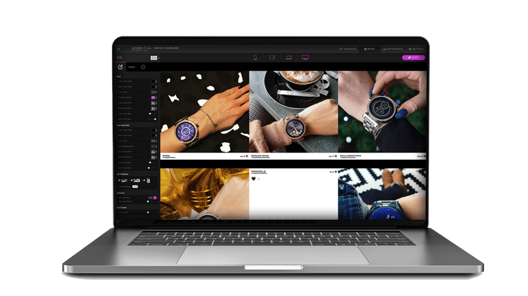
We set out to create an innovative tool that would transform data into branded experiences, using Postano technology as our foundation. Our goal was a customer-driven UI that anyone could use to build branded data visualizations. However, we found out that many clients were hesitant to learn a new tool, especially one requiring creative skills.
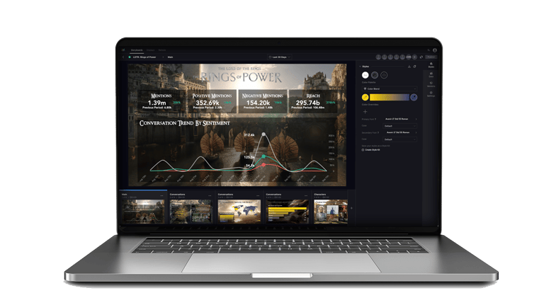
Old UI (Postano)
New UI (Sprinklr)
FRAMING THE CHALLENGE
Project Overview: Enhancing User Adoption through Consistent UI Design
Our goal was to design a user-friendly UI that seamlessly integrated with the Sprinklr platform, making it easier for users to adopt and feel comfortable with the interface. My task include building the possible tunables for some of the charts
Strategy: Creating a Unified User Experience
To accomplish this, I focused on mirroring the design and functionality of familiar software to create an intuitive, user-friendly interface. By aligning the UI with Sprinklr’s platform, we aimed for consistency and clear navigation. Here’s our approach:
Visual Consistency: I matched the UI design with Sprinklr’s style, aligning colors, fonts, and icons.
Easy Navigation: User research and testing guided us in making navigation smoother and more intuitive.
User-Focused Design: We prioritized users’ needs, ensuring the UI was comfortable and easy to use.
Outcomes: Faster User Adoption
The result was a UI that felt familiar and easy to navigate, accelerating user adoption and improving their experience.
Key Takeaways: Consistency and Comfort
The project underscored the value of visual consistency and user comfort, which significantly boosted user adoption by aligning the UI with Sprinklr’s branding and simplifying navigation.
DESIGNING THE FLOW
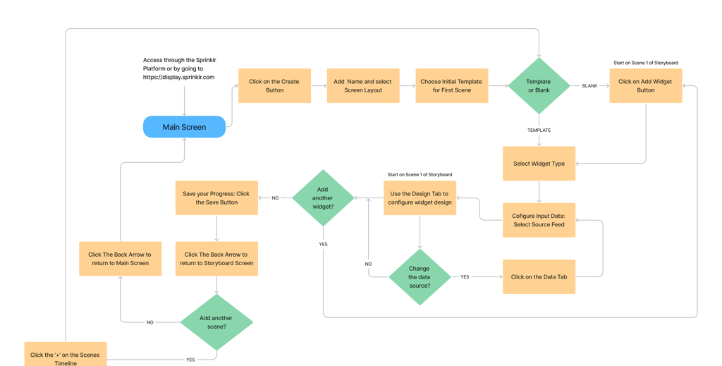
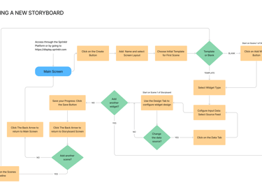
The primary user workflow involves logging into the platform and creating a new storyboard from scratch by combining a series of widgets with relevant information.
Creating a New Storyboard
Sprinklr Dashboard Widgets
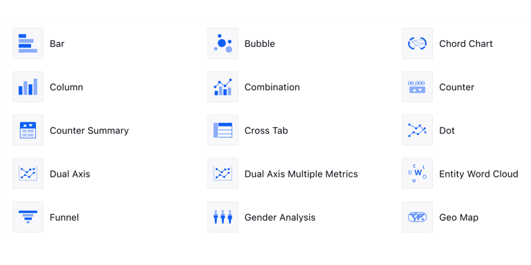
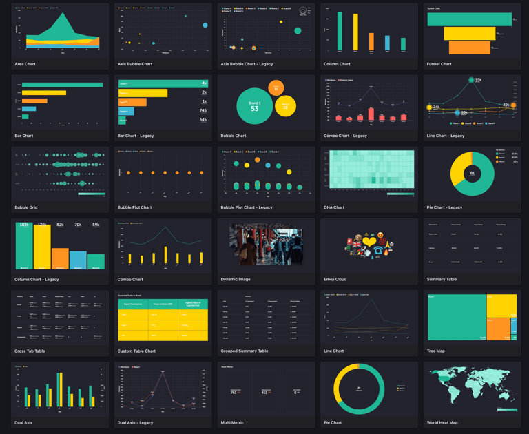
Sprinklr Display Widgets

COMMUNICATION IDEAS
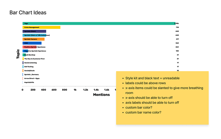
I researched for samples of variations of each of these charts so we could pick them apart and see how effective they were in relating the data, not just looking pretty.
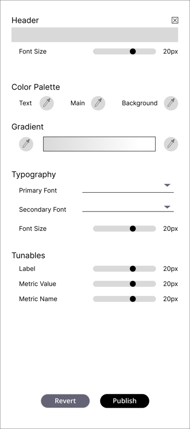
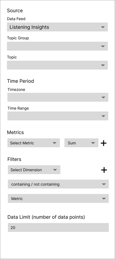
I also had brain storming sessions to see what settings would be best to add as tunables and which settings would be left as the default.




click image to zoom
click image to zoom
click image to zoom
click image to zoom
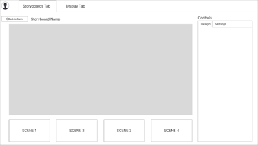
Storyboard Editor
Scene Editor

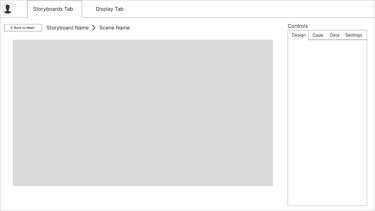

Design Tab
Data Tab
Coding Tab
Settings Tab
click image to zoom
click image to zoom
click image to zoom
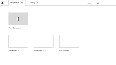

Main Screen
I refined the wireframe designs through rounds of usability testing and client feedback, tweaking the design choices and visual hierarchy with each iteration.
Testing was done remotely with super user clients who agreed to beta test our products. I watched as they navigated the prototype, asking them to "think out loud" to understand their thought process.
BUILDING THE BLOCKS
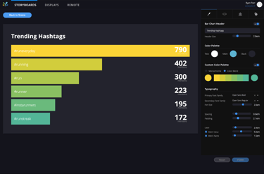
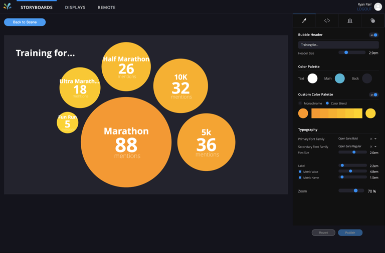
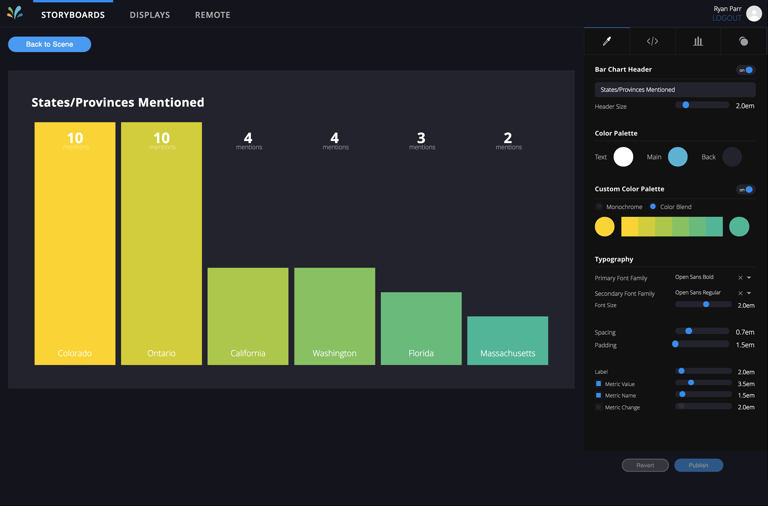
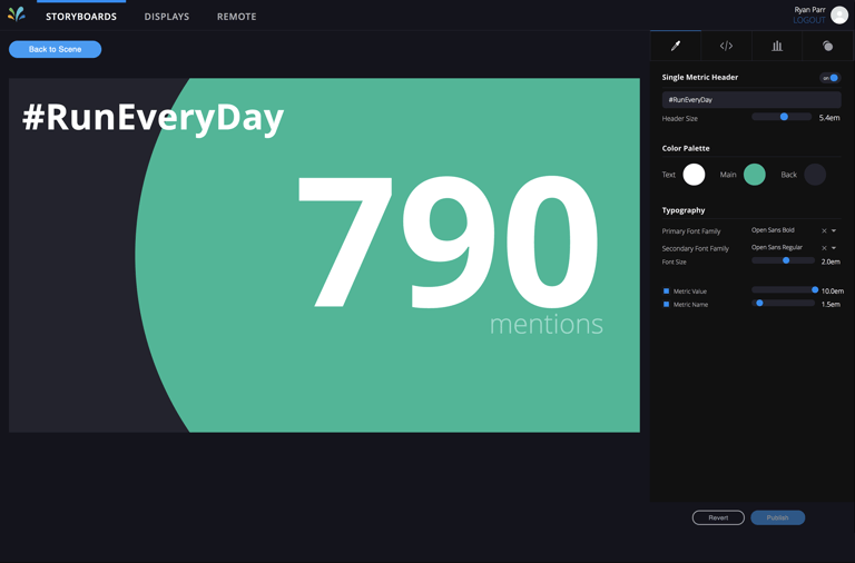
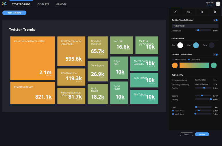
I designed mockups of the tunables tab and combined it with design from the rest of my team that would contain the charts that were gonna be included, adding the unique specific customizable functions of each on the right-side tab.
The Display platform would have a drag-and-drop interface, making it easy for users to select and place widgets—like social posts or charts—on the main panel. Users can resize and move these widgets freely within the panel.
Each widget will come with a core set of customizable features, so users can adjust the appearance and functionality to fit their needs. For more complex widgets, extra customization options will be available to handle different levels of detail and functionality.
Bar Chart (Mark I)
Bubble Chart (Mark I)

Column Chart (Mark I)
Single Metric (Mark I)

Tree Map Chart (Mark I)
Word Cloud Chart (Mark I)
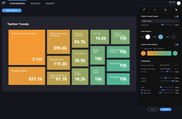
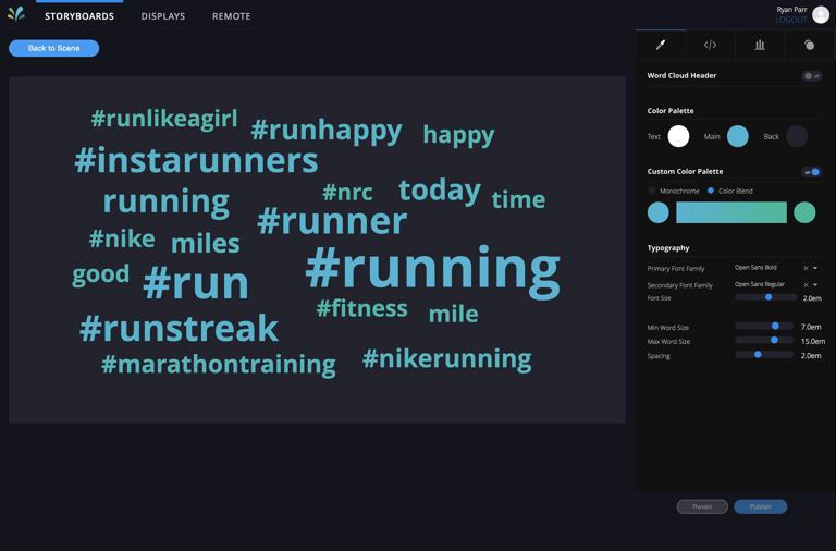
With each iteration, we went back to make design improvements based on user patterns and key pain points. I changed the way tunables look several times, from slider bars to drop downs, to number boxes, et
Common elements in the sidebar needed to be the same in each widget to keep the user flow going. Tunables needed to be separated by groups so the user wouldn't get confused.
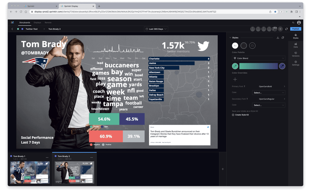
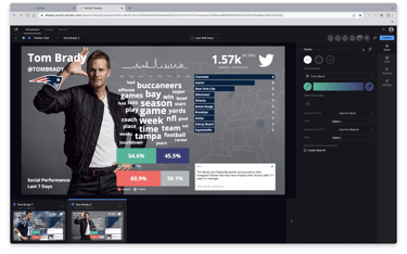
Current Iteration of Display
WHAT DID WE LEARN?
As of 2021, we finished developing the core platform at its current iteration, but we're committed to continuous improvements to adapt to changing trends and user needs. I have focused now on finding different ways to present data, building more widget options, and to add more customization options to our widgets, aiming to make the platform as user-friendly and versatile as possible.
The team has also explored a mobile version of Display, enabling on-the-go adjustments via through the mobile browser. While this presents challenges due to the smaller screens and complexity of the drag-and-drop functionality, we're working to ensure a seamless experience across all devices.
