
ENTERPRISE SaaS · DATA VISUALIZATION · PRODUCT DESIGN · DESIGN LEADERSHIP
Sprinklr Display Platform
Evolving a customization-heavy social-display tool into a scalable enterprise platform for large-format data storytelling.
From 2017 to 2026, I contributed to Sprinklr Display as a hands-on product designer and later managed its distributed design team. My work combined product design, customer delivery, data visualization, technical prototyping and team leadership.
Display builder
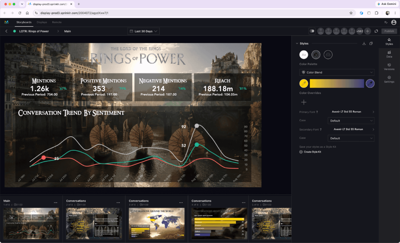
Builder
Published Display
Finished CCaaS Display
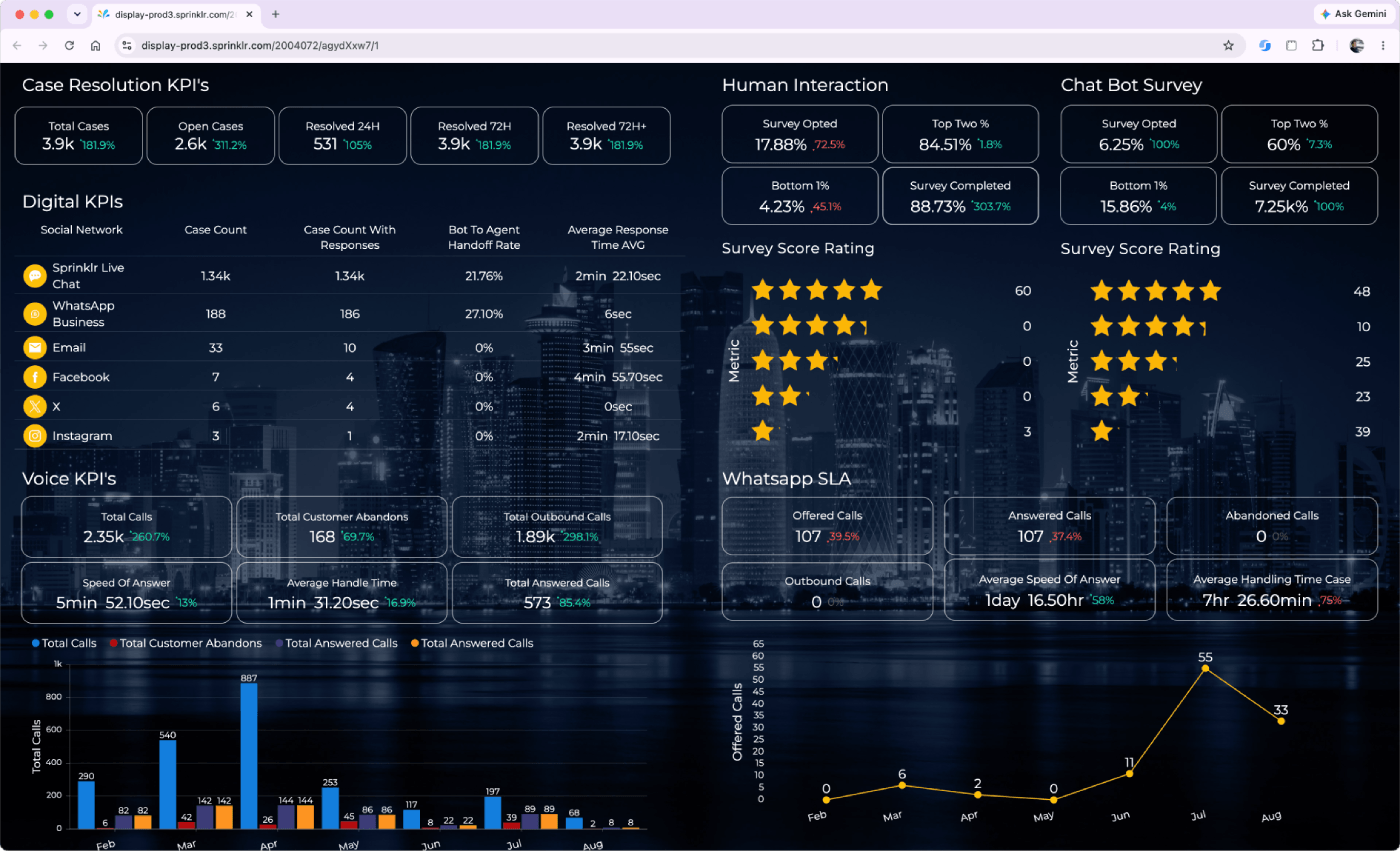
Sprinklr Display paired a browser-based builder with branded, large-format data experiences for command centers, executive environments and events.
Role
Senior Product Designer → Product Design Manager
Timeline
2017–2026
Product
Enterprise B2B SaaS · Large-format data visualization
Scope
Product design · Design leadership · Client delivery · Technical prototyping
Product Overview
From hands-on to design leadership
Sprinklr Display is a large-format data visualization platform used as a principal source of information that tells a story to its audience.
Display evolved from Postano’s social-display foundation into an enterprise visualization platform supporting richer data, more complex customer needs and information-dense CCaaS environments.

Challenge
Customization did not scale with customer needs.
Display’s flexibility often depended on customer-specific design and CSS or JavaScript. Larger data feeds and denser CCaaS layouts exposed new platform, interaction and delivery constraints.

My contribution
Product design and global team leadership.
I contributed selected widget controls, designed customer Displays, translated recurring implementation needs into product recommendations and later managed the three-person global design team responsible for Display delivery.

Approach
Customer evidence informed product improvements.
I worked across customer discovery, information design, technical prototyping and beta validation. As manager, I also guided designers through product constraints and represented the team’s delivery needs in roadmap discussions.

Outcomes
Reusable capabilities and delivery practices.
Recurring needs informed native semantic sorting and responsive widget behavior. The team also established reusable CCaaS patterns, a five-day minimum design window and customer guides later added to Sprinklr’s knowledge base.
Selected impact

Native capabilities informed by recurring customer needs.

Responsive widgets supporting denser CCaaS layouts.

More scalable delivery and customer-enablement practices.
My Display Journey
2017
Joined during platform redesign
2018
Semantic sorting became native
2021
Became Product Design Manager
2022
First CCaaS implementation
2023–2024
Product development resumed with drill-down exploration.
2026
Five-day requirement added to SOW
Product role and context
As display evolved, my role evolved with it
Sprinklr acquired Postano in 2016 and began integrating its social-display model into the broader Sprinklr platform. I joined in 2017 while that transition was underway.
1. A presentation layer for enterprise data
Sprinklr Display turned data from the broader Sprinklr platform into branded visual stories for command centers, executive spaces and events. Unlike a traditional dashboard, it ran continuously on large screens and communicated selected information without requiring interaction.
The product in one sentence
A presentation layer that organized selected metrics, visualizations and social content into slides people could understand quickly or view from across a room.

Both experiences could use the same underlying data but were configured independently.
2. The platform evolution
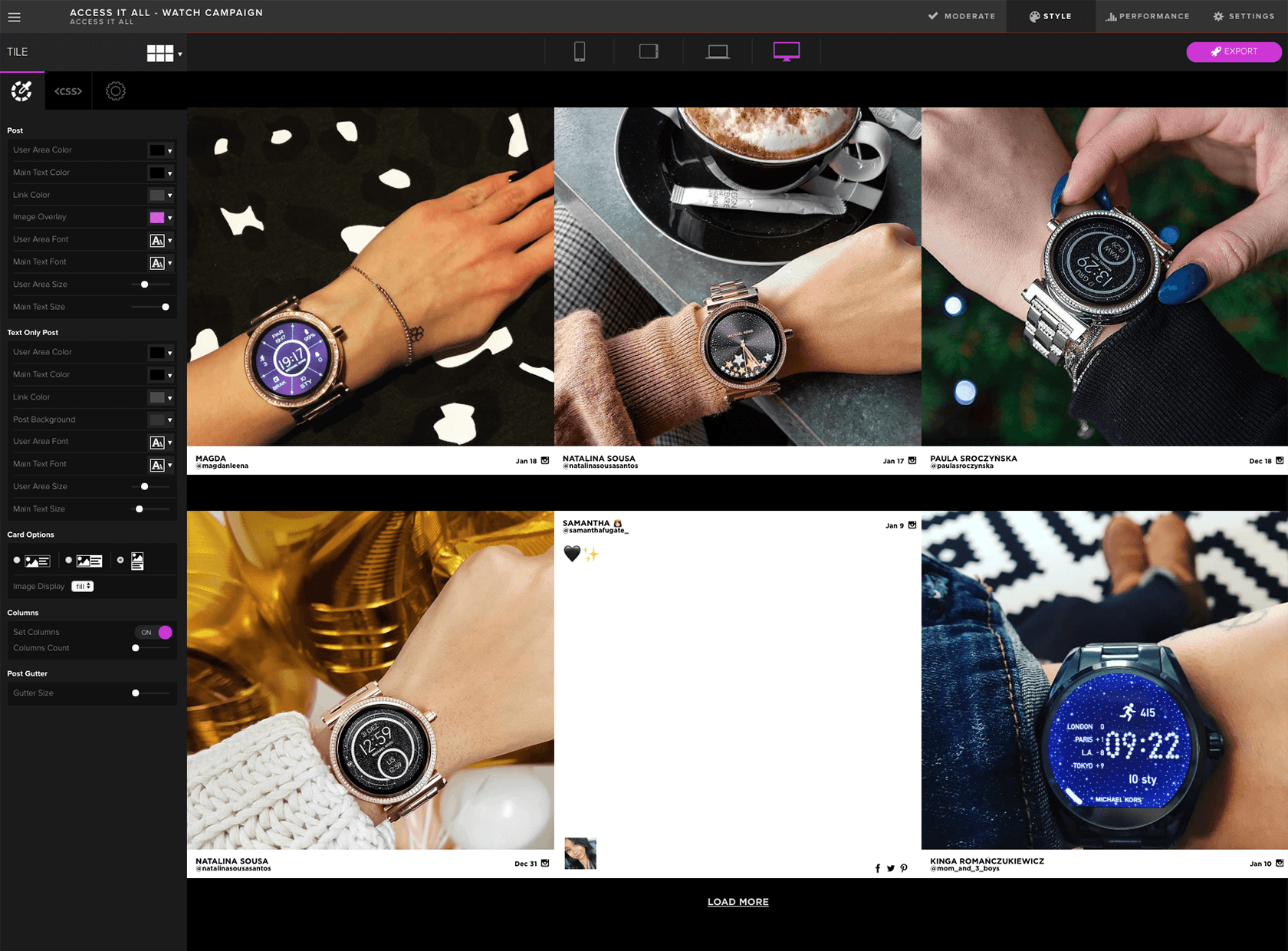
Postano interface during the early platform transition, 2017
- Social content foundation.
- Limited enterprise-data controls.
- Heavy limitations on customization.
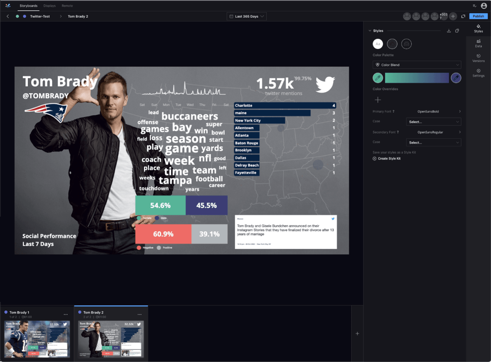
Sprinklr Display builder after the platform redesign, 2022.
- Controls reorganized by purpose.
- Data and visual settings separated.
- Widget-specific controls.
- Broader enterprise-data support.
3. Large screens changed the design priorities
Display was not simply a dashboard enlarged. Viewers might see a slide for only a few seconds or from several feet away, so every screen needed a clear message, readable data and controlled visual emphasis.

Glanceability
Make the primary message understandable within seconds.

Distance Legibility
Keep type, contrast and spacing clear across a room.

Information Hierarchy
Decide what deserves attention instead of treating every metric equally.

Data Density
Balance available information with viewing time and context.

Motion
Use animation to guide attention without distracting from the data.

Brand Integration
Create a recognizable experience without letting decoration overpower meaning.
The audience might look for only a few seconds or from several feet away. Each setting called for a different balance of information, motion and visual emphasis.

Command centers
Information-dense views for teams monitoring activity, performance and emerging issues.

Executive environments
Curated highlights with strong hierarchy, controlled content and limited visual noise.

Events
Branded, motion-led experiences combining live social content with supporting metrics.
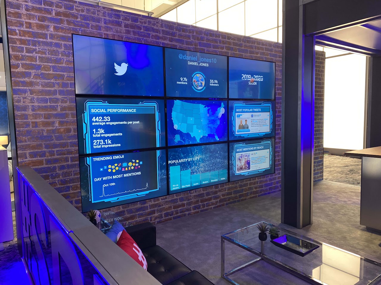
A finished Display designed for quick comprehension, distance legibility and continuous large-screen viewing.
5. Two stages of contribution
My involvement covered two distinct stages: direct product and customer work, followed by management of the distributed team responsible for Display delivery.
Senior Product Designer
2017–2021
I worked directly on the platform and designed customer Displays for large-format environments. My role combined interface design, data visualization, discovery and technical prototyping.
Responsibility List:
- Contributed selected widget controls during the platform redesign.
- Designed branded Displays around customer data, audiences and environments.
- Used CSS and JavaScript to test ideas and address platform limitations.
- Participated in discovery, validation, implementation and training.
Primary Focus
Designing the product and using it directly with customers.
2021 • ROLE EXPANDED
Product Design Manager
2021–2026
I managed 3 designers across New York, London and Dubai while remaining involved in complex customer work and product-development initiatives.
Responsibility List:
- Allocated work across overlapping global projects.
- Reviewed hierarchy, visual direction and implementation trade-offs.
- Helped designers navigate product constraints and Engineering dependencies.
- Represented the team’s delivery needs in product and roadmap discussions.
Primary Focus
Improving design quality, team capacity and the connection between customer work and product development.
How ownership worked
Designers retained ownership of their assigned customer solutions. My role was to provide direction, review important trade-offs, help remove delivery obstacles and connect recurring problems with the appropriate Product or Engineering partners.
I did not own Display’s entire product strategy. I contributed through direct product work, customer evidence, technical understanding and the priorities I represented on behalf of the design team.
Product influence
Finding the product opportunities through customer needs
Customer projects often required CSS or JavaScript to achieve behavior the platform did not yet support. When the same limitation appeared across projects, I documented the need, tested possible behavior and shared the evidence with Product and Engineering.
I contributed customer evidence, working prototypes and implementation feedback. Product and Engineering determined the final scope and built the native capabilities.
1. Making data order meaningful
I. Platform Default
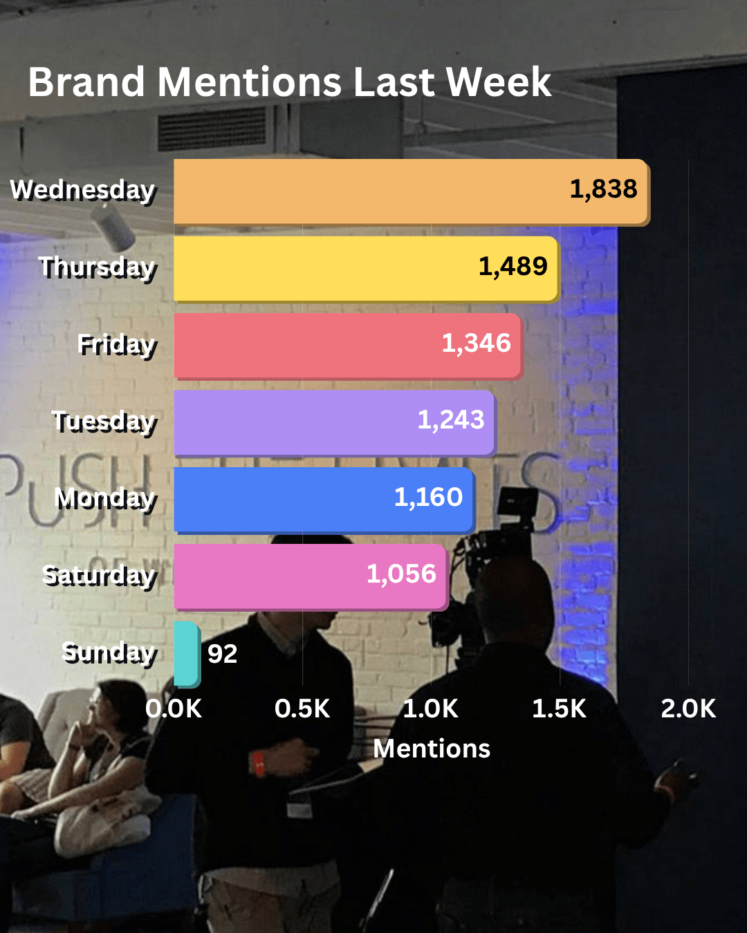
Default data order
II. Custom Prototype
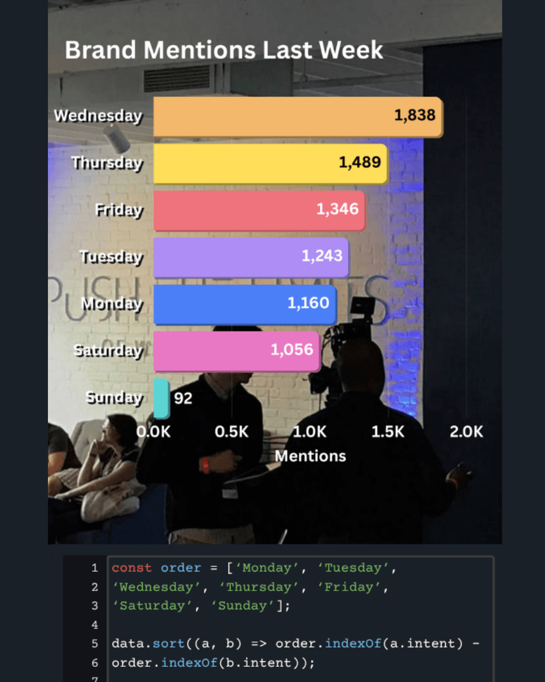
Behavior tested with Javascript
III. Native Capability
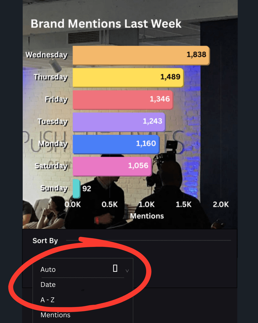
Semantic order supported by the platform
The Limitation
Data followed default or alphabetical order, which did not match how customers think about their metrics.
My contribution
Built JavaScript-based reordering, validated the behavior with customers and documented the need.
Product response
Product shipped semantic sorting controls that make custom ordering a native capability.
A customer-specific workaround became a reusable platform capability.
2. Adapting widgets to denser layouts
Operational environments demanded more information in less space. I used code overrides to build responsive layouts so operators could see what mattered most without losing context.
CAre Command CenTer
Denser operational layouts required less project-specific correction.
3. Customization as a testing ground
Not every custom solution became a product feature. CSS and JavaScript also allowed me to address needs tied to a particular customer, dataset or viewing environment.
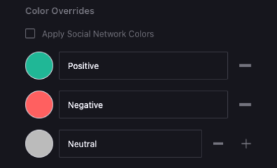
Color overrides
Customer-specific brand color applied to key metrics,
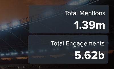
Legibility treatments
Contrast layers on widgets to improve readability of text over imagery.
4. From evidence to product decision
Native Capabilities
Native
Semantic sorting.
Native
Responsive behavior for selected widgets.
Native
Verified controls that became part of the product.
Customer-Specific Solutions
CUstom
Brand-specific color overrides.
CUstom
Specialized legibility treatments.
CUstom
Unique layout or animation requirements.
Takeaways
Custom implementation was valuable because it made product limitations tangible. It allowed us to test behavior in real environments, identify recurring needs and give Product and Engineering concrete evidence for future improvements.
Those same customer engagements also revealed how dramatically the design priorities changed between branded event Displays and information-dense operational environments.
Operational Scale
Creating structure around custom work
As Display projects became more complex, delivery depended on clearer inputs, realistic timelines and reusable working patterns. I worked with Project Management and Enablement to improve the conditions designers and customers needed to deliver effectively.
1. Why delivery became harder
Incomplete data
Key metrics, definitions or data sources were often missing on unclear at the start.
changing requirements
Customer needs evolved during the project, leading to layout rework and reprioritization.
Short timelines
Tight deadlines left limited time for exploration, review and proper testing.
Overlapping projects
Multiple Display requests ran concurrently, stretching design and implementation resources.
The stability challenge
Layout and hierarchy could not stabilize until data, dimensions and priorities were confirmed.
2. Approved data before design
Data determined the structure of every Display. Requiring customers to approve metrics, labels and sources before design reduced late-stage layout changes and gave the team a more reliable starting point.
Display Intake and Approval Checklist
Metric / Widget
Definition
Format
Owner
Approval status
Total Interactions
Total inbound + outbound interactions
Number
Customer
Approved
Service level
% answered within SLA
Percentage
Customer
ready
Average Handle Time
Average duration per interaction
Percentage
Customer
Ready
Customer Sentiment
Positive, neutral, negative
Percentage
Customer
Ready
Top queues
Highest volume queues
List (Top 5)
Customer
Ready
Sanitized example of the information required before layout work began.
3. Reusable patterns, not identical solutions
Reusable structures helped designers begin with proven approaches while preserving room for each customer’s data, priorities and brand.
Shared structure
Customer-specific hierarchy
Faster, more consistent starting point.
Metric Overview
High-level performance at a glance.
Trend + Comparison
Track performance over time and compare key metrics.
Sentiment Summary
Show customer sentiment and related feedback.
Queue Performance
Compare queue volume. wait time or service level.
4. A more realistic design window
A five-day minimum design window was added to the Statement of Work, giving the team time to validate inputs, establish hierarchy, review the design and prepare the final implementation.
Implemented
Day 1
Input review
Confirm data, goals and requirements.
Day 2
Information hierarchy
Define structure, content and widgets.
Day 3
Design direction
Create and share design options.
Day 4
Review and revision
Gather feedback and refine design.
Day 5
Finalization and handoff
Finalize design and prepare implementation.
5. Helping customers work independently
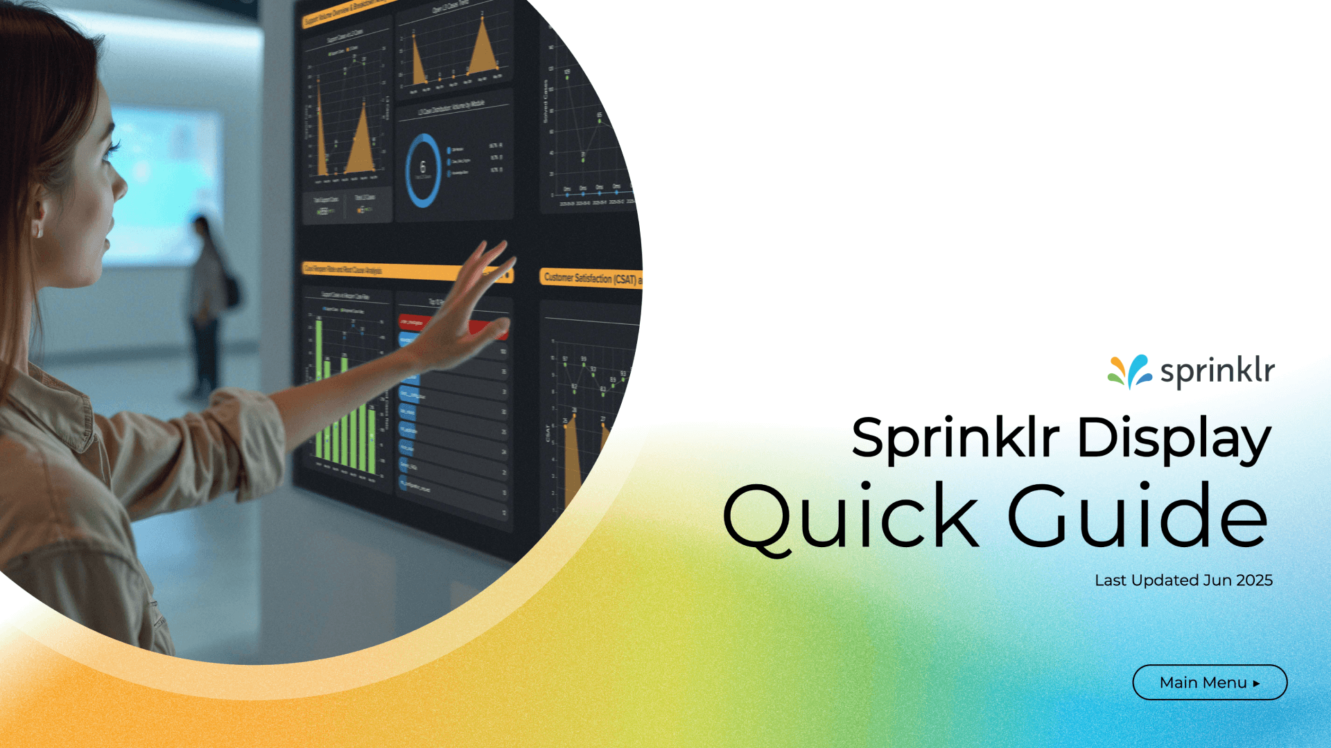
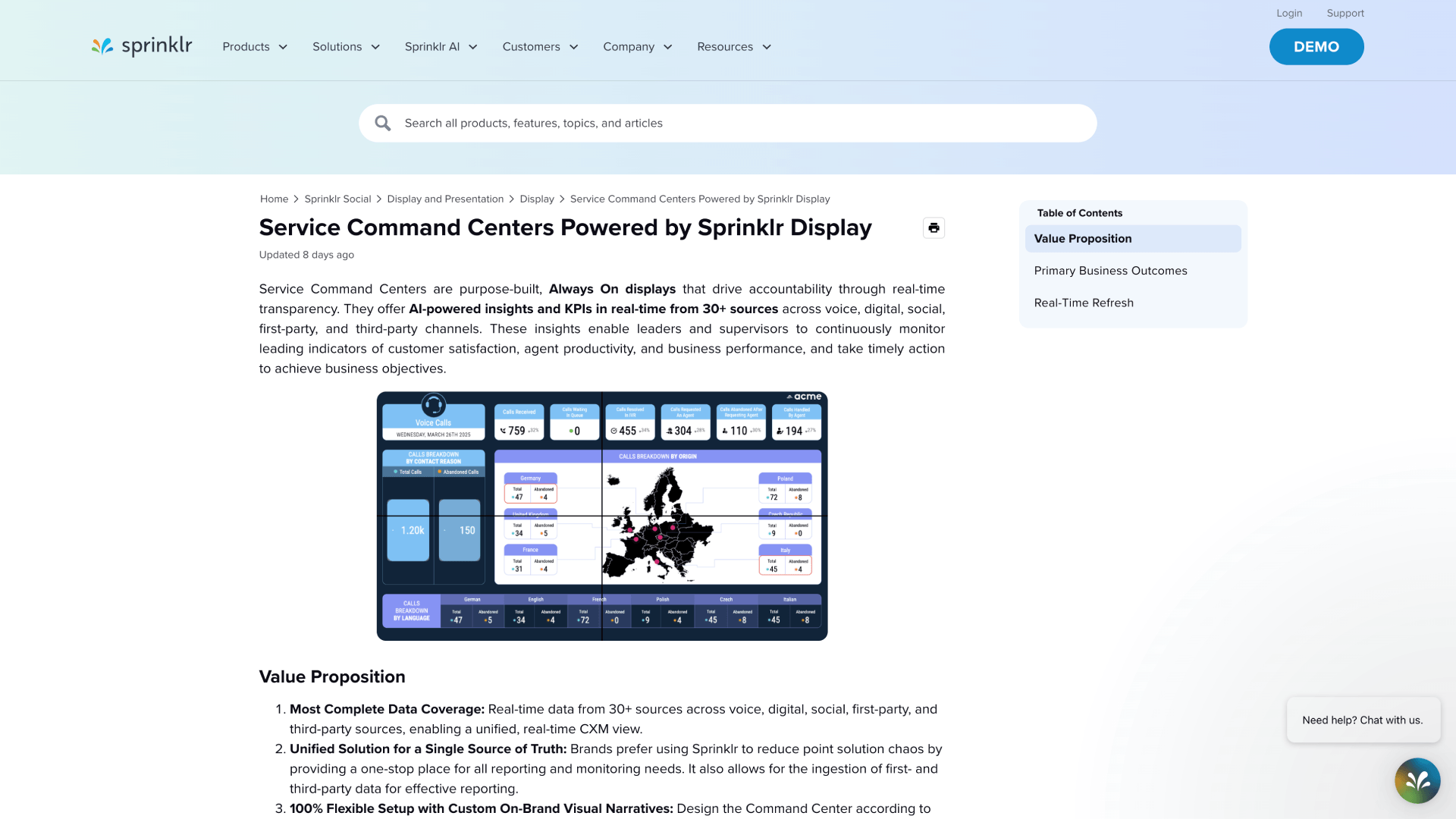
Training combined demonstration, guided practice and follow-up support. Quick guides created for common questions were later added to Sprinklr’s Knowledge Base Portal.
Customer enablement extended the value of the work beyond project handoff.
Customer Quickguide
Sprinklr Knowledge Base
6. Implemented and proposed changes
Implemented
Approved data before design.
Reusable CCaaS patterns.
Five-day minimum design window.
Training and customer guides.
Proposed
Design-hour expectations.
Revision limits.
Pricing and scope controls.
Proposed controls are included as recommendations, not completed outcomes
Takeaways
Better inputs, reusable patterns and clearer expectations made complex Display delivery more reliable without turning every customer engagement into the same situation,
Outcomes and reflection
Looking back at a decade of display
Display evolved through product redesign, customer implementation, CCaaS expansion and changes to how the design team delivered the work. The outcomes below reflect direct contributions, team practices and cross-functional product development.
1. What changed
Native semantic sorting
Recurring customer needs informed a reusable platform capability.
Responsive widget behavior
Selected widgets adapted more effectively to denser layouts.
Reusable cCaaS patterns
Shared structures gave designers more consistent starting points.
Fvie–day SOW requirement
The minimum design window created more realistic delivery conditions.
Knowledge-base guides
Customer guidance extended beyond individual project handoffs.
Drill-down evolution
Later development explored deeper access from shared monitoring views.
2. How to read these outcomes
Direct contribution
Product design, customer Displays, technical prototypes and implementation evidence.
Team practice
Delivery patterns, customer guidance and work completed by designers I managed.
Cross-functional
Native capabilities and platform development shaped with Product and Engineering.
3. What I could not measure
I did not have reliable product-adoption, revenue or time-saving metrics for every initiative. Some product improvements were cross-functional, custom code remained necessary in selected cases and several operating-model recommendations were not implemented.
No supported business metrics
Cross-functional outcomes
Proposals labeled separately
4. What 10 years with display taught me
1. Customer work reveals product needs
Repeated implementation problems can provide stronger product evidence than isolated feature requests.
2. Data and context determine hierarchy
The audience, environment and available data shape what deserves attention.
3. Leadership improves the conditions around the work
Clear ownership, thoughtful review and reliable delivery practices help teams make stronger decisions.
5. The through line
Customer evidence
Design judgement
technical prtotyping
Product influence
Team leadership
Final Takeaway
My work on Display connected visual craft with enterprise product design, technical understanding and team leadership. The most lasting improvements came from recognizing patterns across customer work and helping the right teams turn those patterns into better product and delivery decisions.